About Brooklyn Bridge Park
85 acres along the NYC waterfront. Open 365 days a year. Voted a best attraction in New York by USA TODAY. Roller skating, fishing, rock climbing, basketball—and a killer education program and events to boot. It’s a park, cultural center, events space, and foodie paradise all at once.
When we partnered with Brooklyn Bridge Park on its website relaunch, our goal was to transform their website into a tool to showcase the Park’s incredible landscape, history, and activities.
Our relaunch included a complete information architecture overhaul, SEO strategy, and whole new sections created to match audience interests. Post-launch results have been outstanding. YoY improvements include: +24% improvement in the bounce rate +233% increase in organic search visits +314% increase in pageviews Yes—these are real numbers!
Here’s what we did:
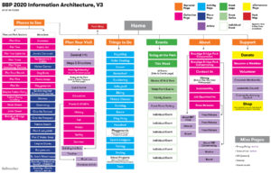
Audience-Centered Information Architecture
Bellweather’s layered research approach reveals audience journeys
Bellweather combines qualitative and quantitative research to uncover what visitors are looking for. This process uncovers new ideas for content and better ways to organize existing content. Through a combination of analyzing organic search data and dozens of interviews with staff and visitors, we found:
- Tourists appreciated grand, photographic vistas that included the river or Manhattan skyline as an orientating element—sometimes, recreating this photograph became the starting point for their trip
- Locals often planned visits the day-of or day-before based on the weather or events
- Prior to a visit park attendees did research, often for particular questions (What food is available? Can I bring my dog? When does the Park close?)
- While at the Park visitors wanted the same things: to find bathrooms or a place to eat nearby
Custom User Journeys
From these interviews, we developed the Park’s own “travel funnel” based on common User Journeys we discovered (a riff on the standard travel funnel). These four lenses provided a clear strategic guide for UX, design, and content:
Content for People, Not Just SEO
Helpful information, defined by data
Through interviews, we uncovered a helpful trove of information from staff who answered the main phone line or general email account. They shared that the majority of inquiries were the same questions: is there an entry fee; how do I get a permit; are the barbecues kosher; what are the hours for the playgrounds? They asked if the website could more clearly answer these queries. If there was a way to reduce these inquires, staff time could become more efficient, too.
To answer this need, we created a sitewide FAQ content type that can be used on each and every page, as-needed. To keep updates seamless for the staff, each individual FAQ query is its own singular piece of content in the backend; this individual FAQ can then be placed on multiple pages. (It would be an enormous task to remember and update multiple pages that share the same FAQ text!) Our shared, sitewide FAQ content system allows staff to add or update in one place and have it update sitewide.
FAQs in search results
A bonus: FAQs were recently introduced within Google’s structured data library. The site’s FAQs are developed to look great on-site and to leap into search results.
From an Unwieldy Blog to Organized Articles
Blogs on large sites get unwieldy after a few years—content becomes difficult to find and navigate. The previous site used a blog for publishing content. At the time of the relaunch, there were 600+ blog posts that spanned from timely (a post about an upcoming event) to more evergreen (a post about hermit crabs found in the East River.)
To help better rank for search and allow users to find related articles, the blog content was repurposed as supporting content within appropriate sections (or sunsetted, if no longer useful.) Articles about hermit crabs found a home in the new Plants and Wildlife section, interviews with volunteers were moved to the Volunteer section, and so forth. Now, articles link back to parent pages that provide narrative structure to the Park’s updates.
Design for Scanning
Perhaps the Park’s biggest website challenge is containing and organizing the dozens of places and activities, and hundreds of events. Through interviews, we heard that visitors were mostly unfamiliar with the Park’s incredible expanse or breadth of available activities. From fishing to roller skating, award-winning ice cream to award-winning playgrounds, Brooklyn Bridge Park has more in common with an amusement park or neighborhood than a standard city greenspace. We wanted to help show the expansiveness while making it navigable.
A scannable design system
Users scan websites instead of reading them top-to-bottom. We designed multiple scannable lists to help users discover content:
- For scannable lists of activities, we picked up the Park’s signage and used playful icons from the Park’s brand. (We also expanded the icon set, building on the original 10 icons to create a complete set of 24.)
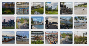
- For scannable lists of places, we picked up on the Park signage’s use of photographic tiles. Walking distances are calculated automatically using the latitude and longitude identified in each Park Map location.
- For scannable events, we developed a clear typographic and color-coded system. Supporting information such as ticketing cost and location are designed to be unobtrusive yet clear.
Mobile-first Mapping for Discovery
When travel or attraction websites need a map, there’s a standard solve: a Google Map dropped into the site, with the colors adjusted to be more in line with the brand. The problem? Google Maps API now charges for map API calls, and who needs a Google Map on a website when they can just open up Google Maps?
Going beyond Google Maps
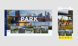
To help visitors explore, plan, and orient themselves as they navigate the Park’s sprawling landscape, we re-envisioned the traditional (i.e., Google Maps) website map. The Park’s branded map functions like a native app and is accessible within the main navigation. And, unlike most website maps, the Park’s map allows you to locate yourself and also blends icons, photos, and actionable information—such as hours of operation and current events. Visitors have access to all that the Park has to offer in one place.
A Website that Looks and Feels Like an App
The Park’s navigation needed to serve the needs of visitors at all stages of visit—from planning to exploration. We developed a mobile-first toolbar that docks at the bottom and allows users to navigate the site for either planning on in-park orientation. The pocket guide-esque navigation allows for users to access the content they need by locating it on the branded map, using search, seeing what’s happening today, or using traditional site navigation.
Read our case study to learn more


