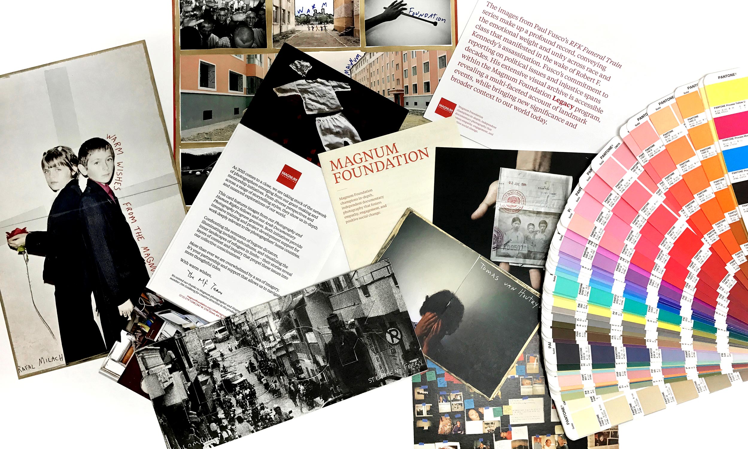
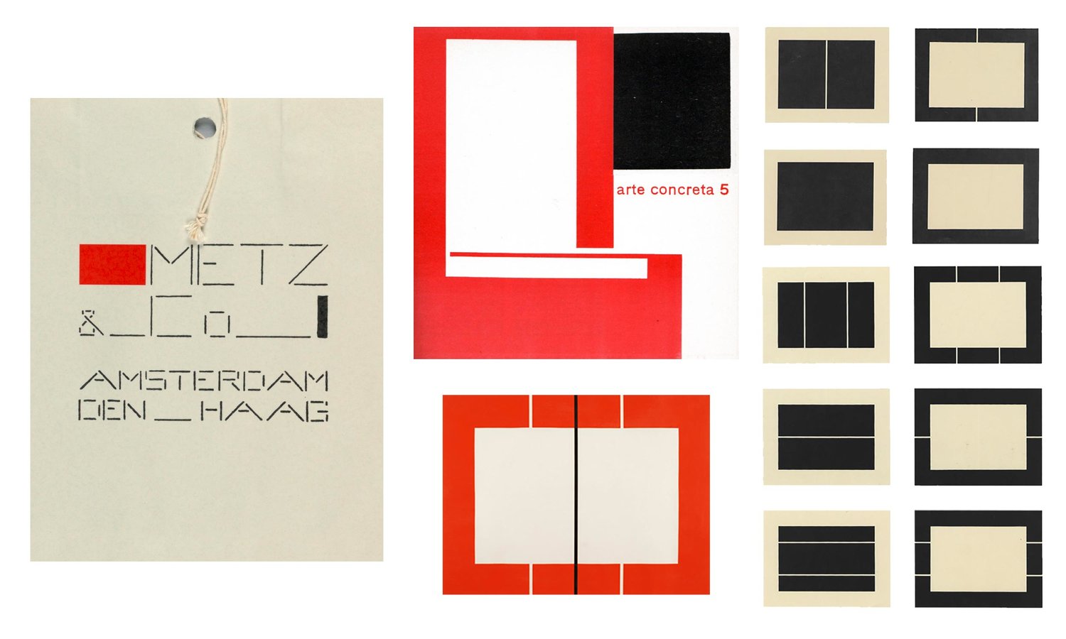
It’s a delicate challenge to give an existing cultural brand a refresh, especially for a cultural institution as impactful and beloved as the Magnum Foundation. As with every rebranding we’ve done, we started by combing through what came before. We looked at the visual history of Magnum Foundation, and began to parse out what was distinctly Magnum-esque. The first thing we recognized is the most obvious: the red square. The square is perhaps the most identifiable element, and we knew we had to preserve its legacy. What happens if a commitment is made to the square? What kind of forms and compositions come from this commitment, and how can the consistent shape yield surprise and delight? We looked at artists who were inspired by constraint: from Donald Judd to Bauhaus designers. We found out a square can offer a lifetime’s worth of variations, as long as you’re ok with some restrictions.
We paired the mark with approachable, upper-and-lower sans-serif typography—a good companion with the rigid square. We recognized there was another star waiting in the wings: the M. We created a bespoke M that was sharper, more pointed, and ultimately more distinct. It quickly led to another unexpected hero: the MF monogram.
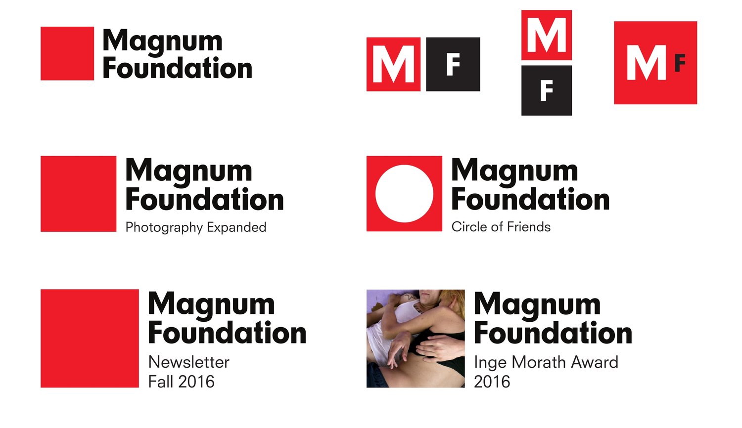
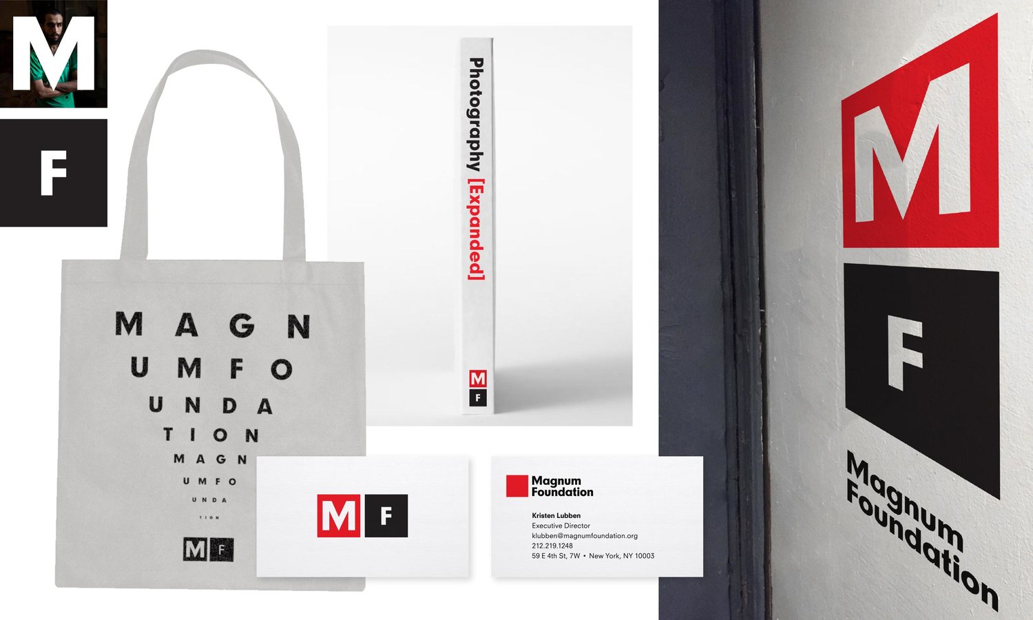
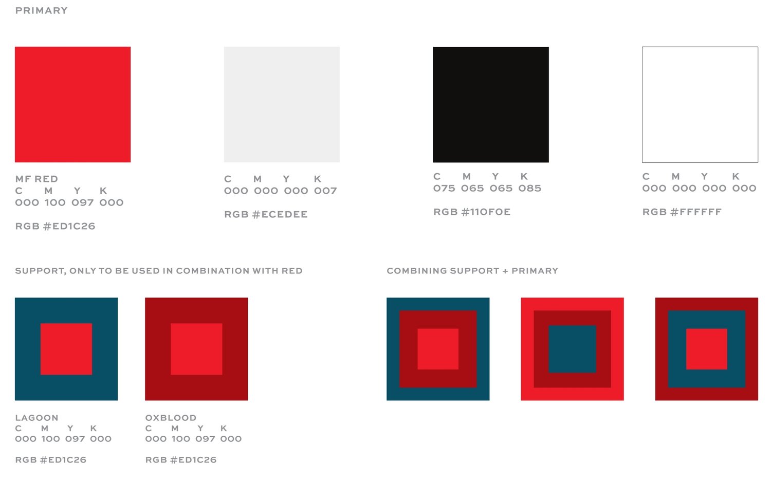
Finally, we recognize what anyone in 2016 knows: red is having a moment, especially for cultural institutions. It can also be a difficult color to use alone. We made the Magnum Foundation red more vibrant, and paired it with some companion colors that would help reinforce its leading role. (A special shout-out to Mr. Josef Albers, who is often a collaborator at the Bellweather studio.)
The result is an updated cultural brand for the Magnum Foundation, built from its legacy and reinvigorated with a cast of supporting elements. We are honored to support Magnum Foundation’s mission, and hope our work helps it grow for many years to come. What we drank while we worked: A lot of Sweetleaf’s “rocket fuel,” especially during our marathon M-drawing days. See the post on the Magnum Foundation blog. Ever wondered what a design studio sounds like while drawing dozens of M’s and picking a single typeface out of 13,000+ options? Here’s what we listened to while we worked on MF: Bellweather + Magnum Foundation Spotify Playlist