Do you need a new logo? Wondering if your company logo needs a refresh, but not sure if it’s just you? Great logos are memorable and well-made—they can withstand moving from digital to print flawlessly. Wondering how your logo stacks up?
Your logo should be able to pass three tests:
1. Can your logo scale?
Is your logo illegible when it’s small on your mobile website? Does blowing it up on a banner make you cringe? Does it have to stay at certain size to be readable? Your logo needs to look flawless on your website, your social channels, and in print. Anything less costs you customers. If your logo cannot handle jumping from mobile to print seamlessly, you need a new logo. Love your logo but have this problem? We have good news! You can keep your existing graphics with a logo update (sometimes we lovingly refer to this as a “logo facelift.”) Logo updates take different forms: we take the design and tweak for legibility, or we create different versions of your logo for small and large sizes. You’ll see how we handle this in our rebrand for the Magnum Foundation:
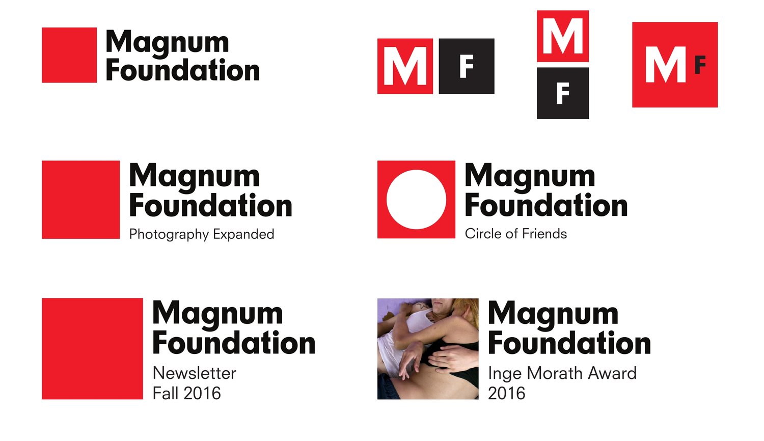
Our rebrand for the Magnum Foundation includes a logo suite that scales for any situation and size. The new logo is inspired by its original logo: it keeps the same red square and typography. We paired it with a suite of logos that easily adjust to any size or opportunity, be it an Instagram account or a poster. Because typography needs to be drawn differently to scale at such extreme size changes, we highly recommend a logo palette that includes multiple variations for different size thresholds. Every brand we deliver comes with a logo toolkit for exactly this purpose. Now onto question two…
2. Does your logo look great printed?
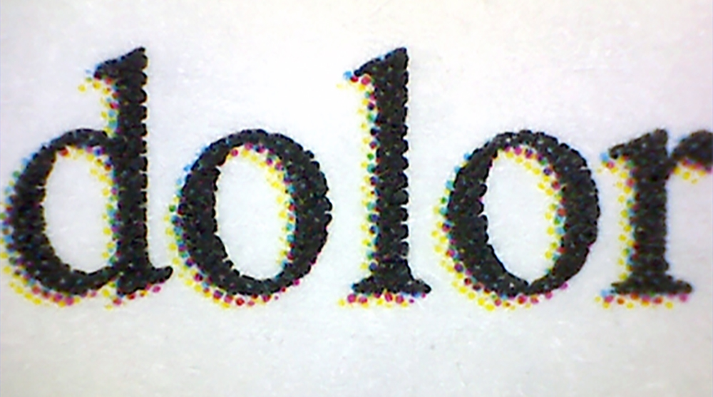
Feeling disappointed every time your logo comes out of the printer? Does the color look bright on-screen and then dim or muddy when you print? If this sounds familiar, your logo uses colors made for the screen and NOT for printing. As we’ve said in another color-focused post, there are some colors on your screen or phone that will never come out of a laser printer. Some designers use these colors and a client will fall in love with what they see on the screen, but the color can’t translate in print. This is normally due to a designer not knowing that some colors are out of range for print or screens (what’s called in nerd terms as being “out of gamut.”) You can get those colors in print, but you’ll have to pay for a Pantone color to see them. We’ve fixed this color mistake many times. We provide our clients with two sets of logo files (one for CMYK and another for RGB) so your logo always looks bright and flawless. Your business is expected to look great in both print and digital, and we can get you there. Last question…
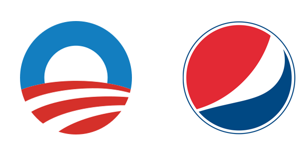
President Obama’s 2008 logo versus Pepsi’s 2009 logo
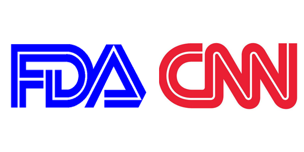
The FDA and CNN logos have a lot of visual overlap
3. Does your logo look like something else?
Do your customers say it reminds them of another brand? Have you been asked on repeated occasions to explain what it means or signifies? Great logos operate as a visual shorthand for your ideas, goals, and message. If your logo is confused for another brand, or you spend time explaining the meaning behind it for it to make sense, take a long hard look at the message you’re sending to clients. Another similar problem: does your logo rely on overly trendy design? Does it use a typeface or design treatment that you’re suddenly seeing everywhere? You need a logo and a brand that will last for years—great logos exist outside of trends.
Logos should support your investment.
You’ve spent days, weeks, months, even years building your business and your career. Your logo should support your investment. You need a new logo if you feel your energy and efforts are not being supported. Ready for a new logo? Let’s go!