The creative strategy behind nycgo.com – winner of Best Travel Website via the Webby’s. You can also see our portfolio overview.
The Assignment
Imagine capturing New York City in a single experience. Your final product must inspire without being unattainable. It must feel big and ambitious, but also easy to navigate. Include imagery, text, eCommerce, icons, and maps. And above all: the work must feel authentic. Now take all these ideas, and make something that fits onto a mobile screen. You have five months. This was the challenge for the new nycgo.com.
Creative Strategy
nycgo = Inspiration + Navigation
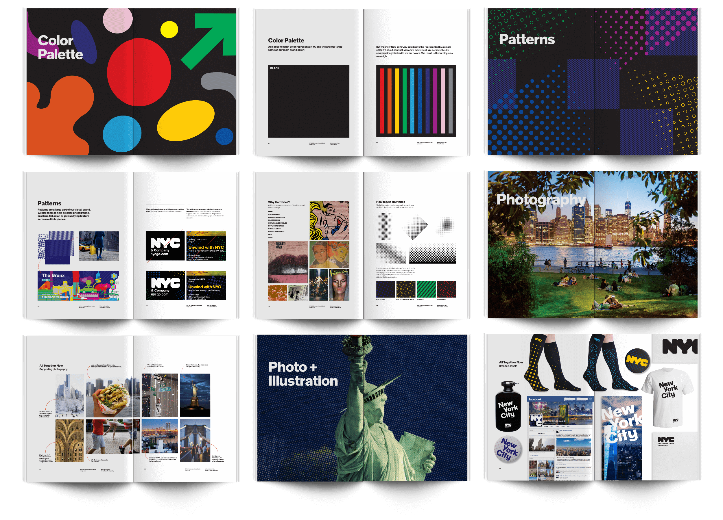
We recently finished a sprawling rebrand of NYC & Company, and the last piece to finish was the website NYCgo.com. The project took a year to complete and touched nearly every piece of the organization, from its advertising to its business cards. The rebrand’s creative strategy centered around creating vibrant, flexible brand tools that could unify many different creative needs—from photography to videos to illustration. The goal was to have a visitor know as they transitioned from piece to piece that they all came from the same brand. The last piece in the rebrand was the website.
Project Background
Goal: Drive visitation to NYC (60+ million visitors yearly) — Site Visitors: ~12 million visitors yearly — Content: Over 9,000 pages — Advertising: Generates millions of dollars in yearly advertising revenue — eCommerce: Integrates multiple eCommerce partners (Booking.com, OpenTable, Viator, and City Pass, among others.) NYCgo.com is also the home for celebrated eCommerce events like NYC Restaurant Week and NYC Broadway Week. — Timeline: 5 months – !! — Awards/Accolades: 2017 Webby Award Winner for Best Travel Site 25 Best Tourism Websites in the World by Skift Five Best Tourism Websites to Inspire You With Visual Storytelling by Libris “Premiere tourism bureau when it comes to web design” by Flight Network
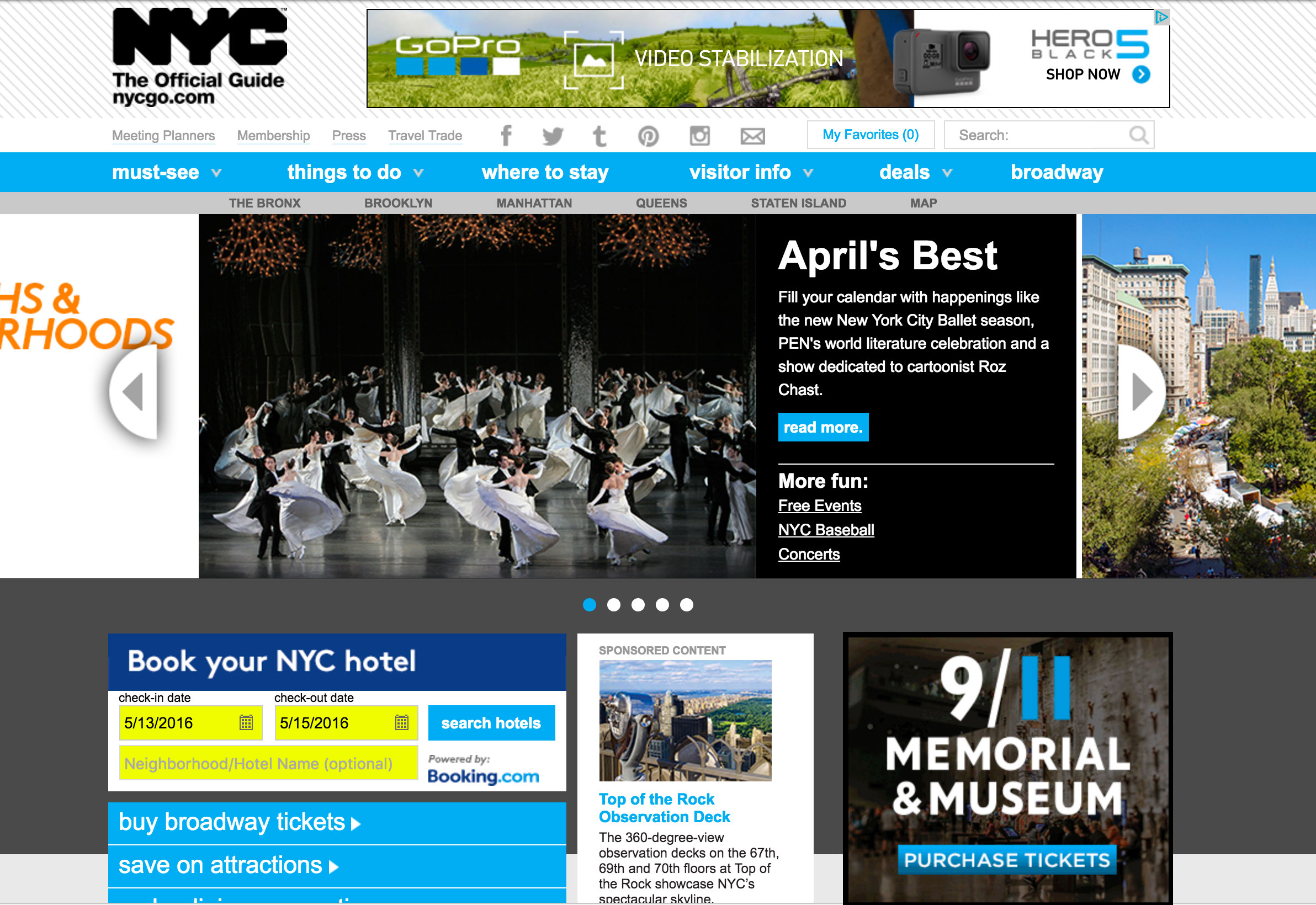
nycgo.com before the relaunch NYCGO’s website design had undergone many changes over the years, and no longer visually unified. It served its time well—drawing millions of website visitors yearly. However the site was not mobile-friendly, and much of the content had to be manually loaded or adjusted due to problems with the CMS. All of this caused a drain on internal resources. It was clear NYC & Company needed better tools and a fresh start. Our creative team was ready for the huge challenge. Our team had just spent a year building the NYC brand and translating it across dozens of different mediums. It was a natural step to translate the brand into the digital world, as we spoke the brand language fluently.
The Ask
Relaunch nycgo.com as the premier website for inspiration and activation for visitors and NYC locals. Make sure it’s mobile-friendly and built for maximum SEO. The greatest challenge was the timing: we had just five months from start to launch. If we missed the deadline, we’d have to wait until the end of the busy summer season.
The Creative Strategy Part 1: Define the Goal Posts
Because of the crunched timeline, we had to find ways move fast. Why do athletes move so fast? Because the goal is visible and clearly defined. The same is true for leading a creative team, or any team of people. The more visible and clear the goals are, the quicker you can move towards the same goal. Thankfully, Emily had developed a brand strategy that served as the foundation: Inspiration and navigation—these two ideas support so many others. If you are inspiring, you are naturally authentic. If you dedicate yourself to aiding navigation, you are telling a story of accessibility and inclusivity. Inspiration + Navigation became the foundational goal posts for the creative strategy. By setting inspiration and navigation as the clear goals, we were able to work together as a team to quickly ideate and make decisions.
The Creative Strategy Part 2: Make Strategy Visible
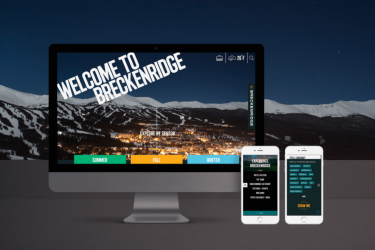
Video is the most impactful move we could make to support inspiration—it helps project a sense of time and place that photographs can’t. We committed to being video-first from the start. And not just any video. We nicknamed the top videos “video postcards” because that’s just what they are: inspiring, light-filled vistas that just happen to be moving. Something happens in every video—whether it be someone walking by, people enjoying an outdoor meal, or a parade going by. There are no posed people and there is no unnatural light. These “video postcards” tell an inspiring and accessible story of what it means to be in New York City today. We made over 150 videos for the site launch alone, and we committed to an oversized placement so they could be the hero of the story. Navigation can mean many things—and the site had to do all of these things well to be successful. It can mean mapping—being able to locate yourself or a spot in the City. It can also mean finding related items (nearby stores or restaurants, or other art galleries, for instance). To make navigation effortless, each piece of inspiration is always paired with orientating content. You can see this again on the overview pages. Beneath the video postcards are dozens of supportive pieces of content and design, all made to help you navigate a visit. This system of inspiration first, with navigation as support, was one of the first things sketched:
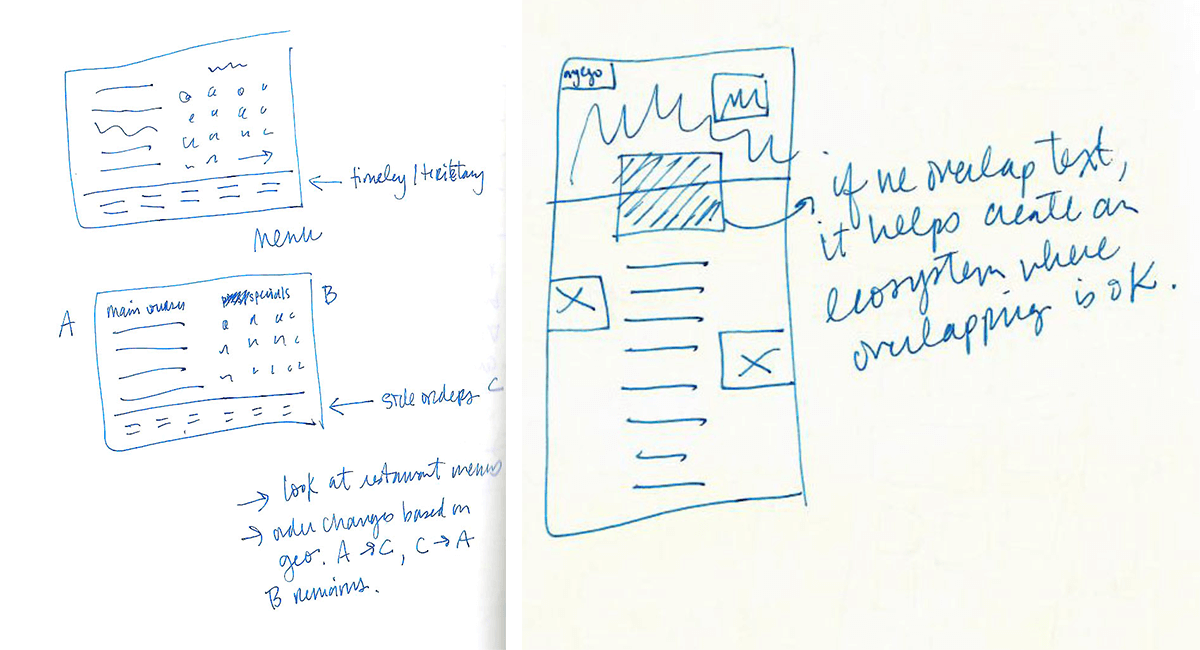
This clear hierarchy helped generate thousands of pages, all with supporting pieces of content to help make a visit more exciting and more engaging. We also created a navigation approach that was both orienting and inspiring. It was also based on a strategic decision to be less English-centric. Even the best translation tools might mangle the names of NYC icons like Prospect Park or Top of the Rock. The solve? Make the beloved icons instantly recognizable. We developed a bespoke set of illustrations that bring the navigation to life and quickly drive audiences to popular content and destinations. Committing to navigation also means you can have some fun with being lost, as in the 404 page:
The Results
- 20% increase in traffic
- 120% increase in advertising revenue
- 9+ minutes onsite spent per visitor
- Webby Award: Best Travel Site 2017
- Huge jump in SEO
- Seamless eCommerce integration throughout
What’s Next for Bellweather
We are thrilled to bring this level of integrated creative strategy and execution to all of our clients. We are currently working with several place-brands and DMOs, building custom, mobile-first, inspirational websites and brands. Cheers to our next Webby, and to our past and future collaborators. With huge thanks to the creative team (most of whom still work closely with us) Team Leaders: Emily Lessard, Lead Creative Strategist + Creative Director; Louis Lee, Lead Navigation UI Designer Designers: Caitlin Clingman, Sara Duell, Alexander Quinn, Jose Quinteros, Noah Venezia Writers: Kate Canary, Michael Chee, Sophie Roberts Photo & Video: Jen Davis, Kathleen Fox, Naheem Kujenya, Thomas Perry, Christopher Postlewaite, Ryan Schnackenberg, Gracelyn Woods, Tagger Yancey