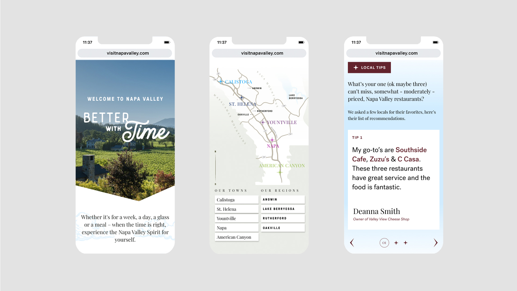
Our website strategy blended multiple data sources including an extensive SEO audit, existing marketing findings, and stakeholder insights garnered from dozens of on-the-ground interviews. Our findings resulted in several new pieces of content, including first-person visitor tips, expansive FAQ sections, and a bespoke map.
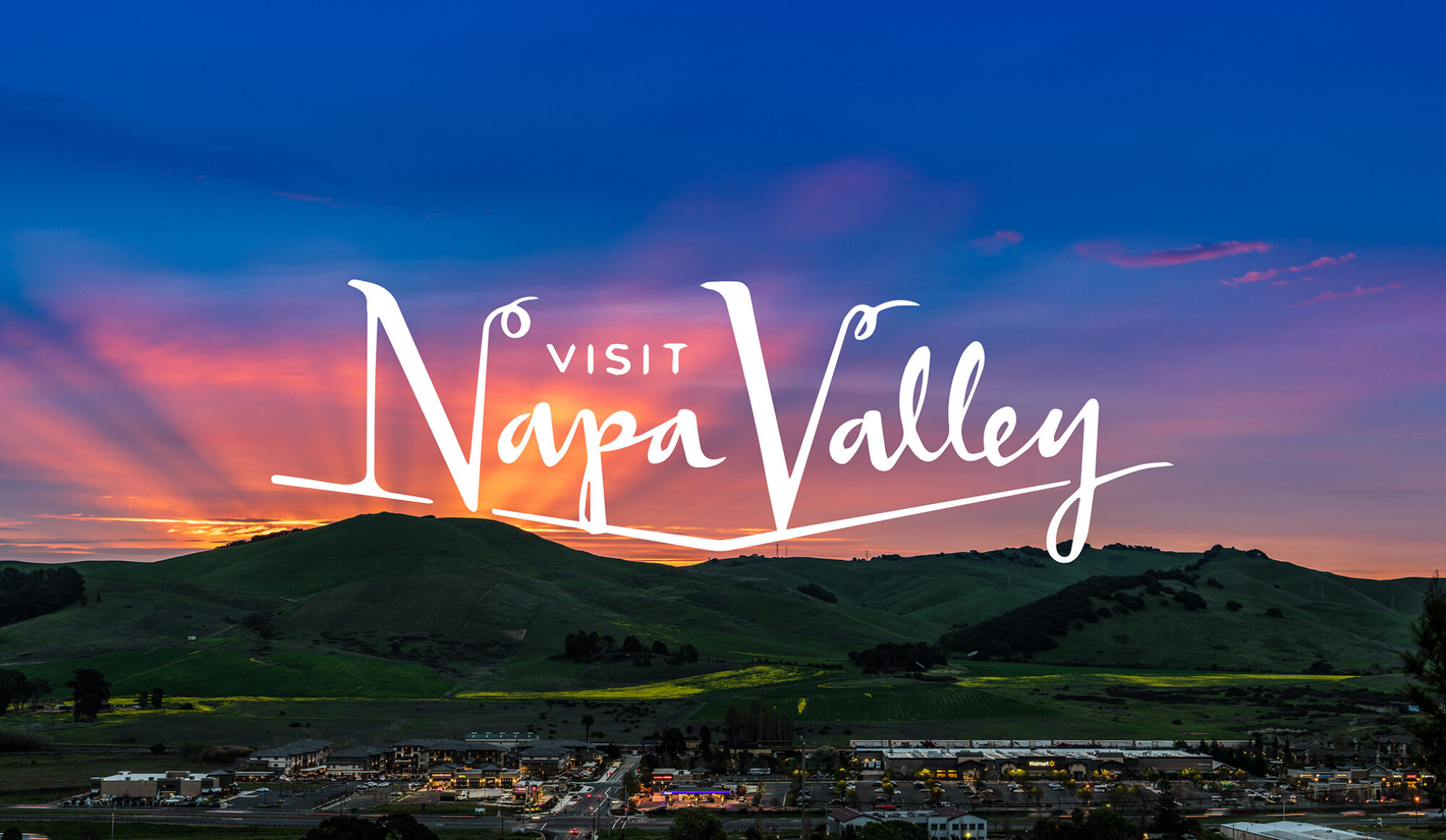
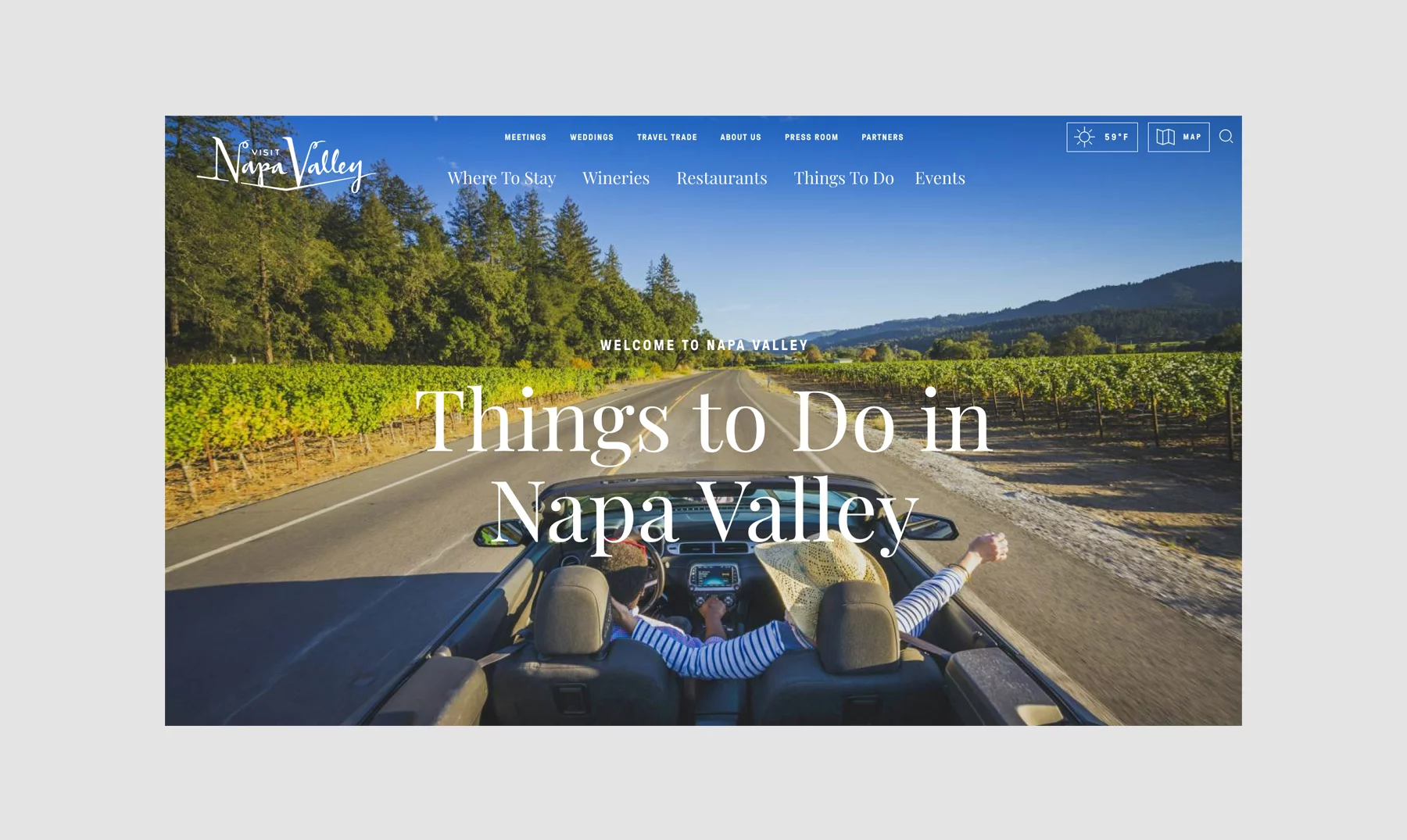
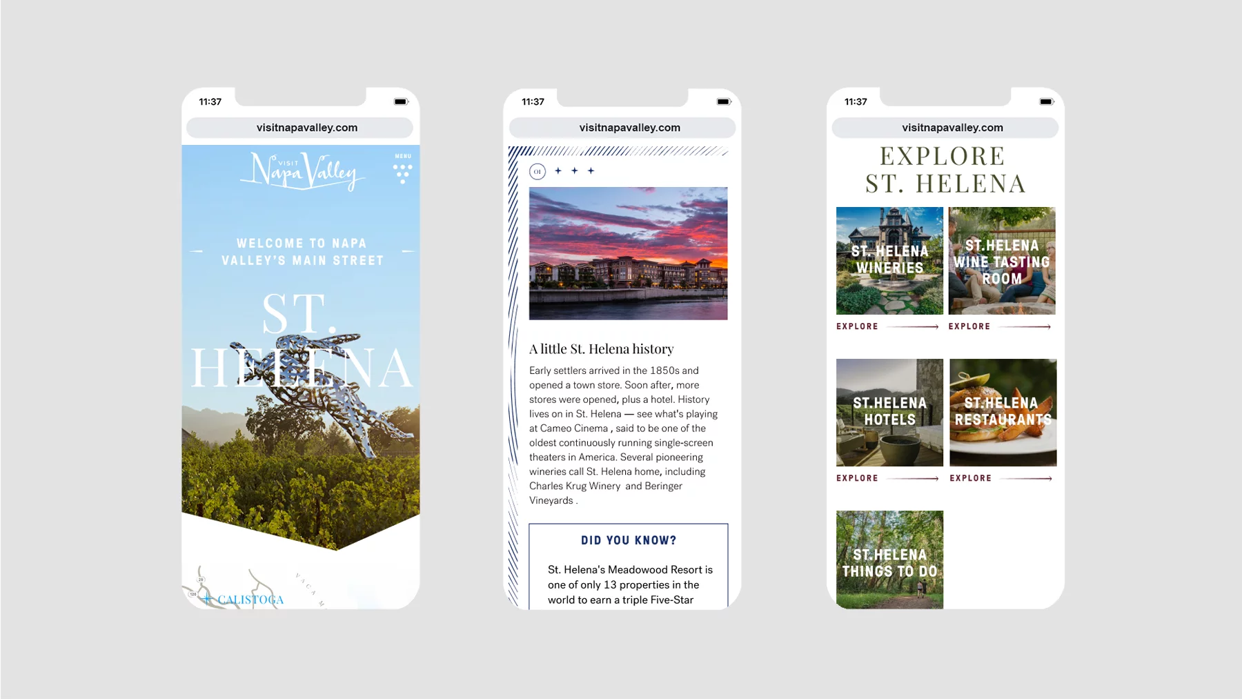
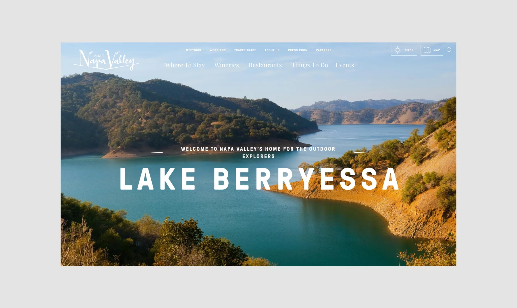
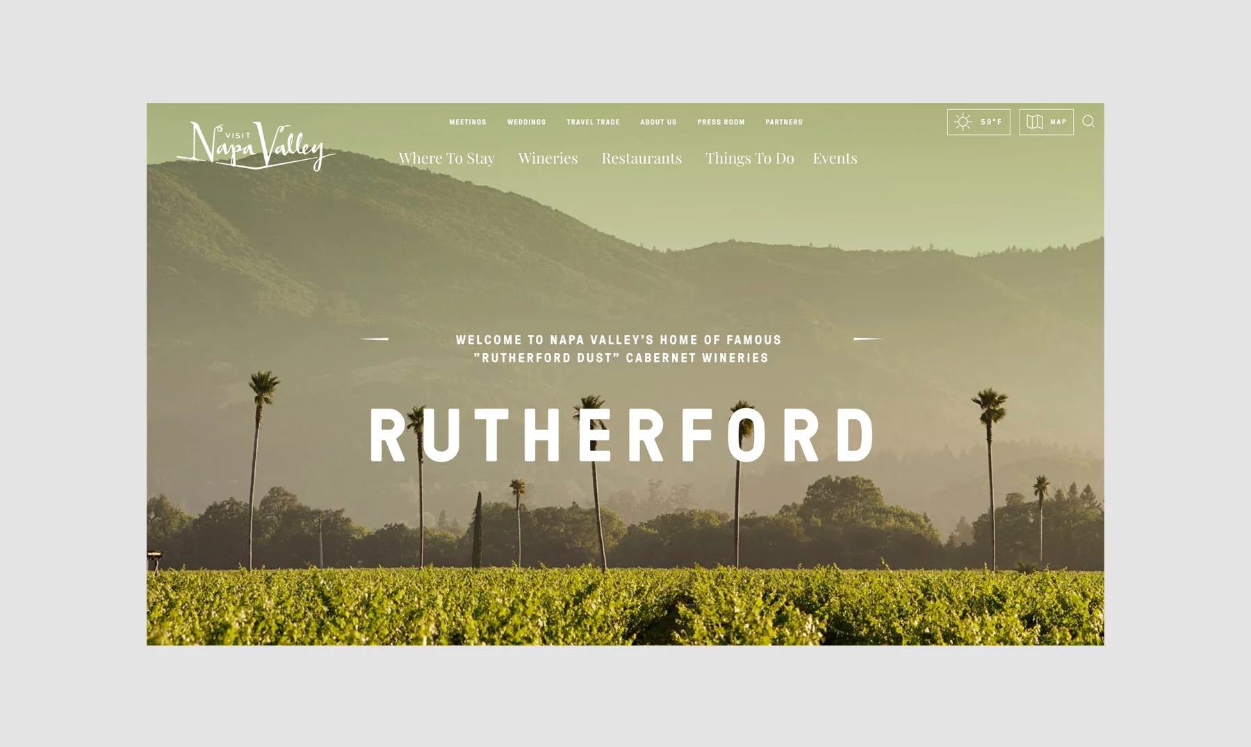
The final website design brings the visual brand to life with layered content, playful mapping, and inspirational imagery that speaks to the incredible experiences found in Napa Valley.
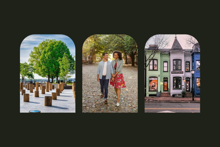
We built upon Visit Napa Valley's existing brand to create a lush web experience. The valley-shape found in the logo becomes a way to crop images while also guiding a visitor down the page. We also added illustrations and atmospheric gradients to the brand toolkit to speak to its verdant wonderland.
We found that the different towns and appellations within Napa Valley could be unfamiliar to first-time visitors. To help inspire longer visits and expand economic opportunities throughout the region, we designed a valley-wide map to orient and inspire visitors. The map became a foundational brand element and is used throughout the website, in visitor guides, and as a super-graphic on the Napa Valley visitor center.
Bellweather led research, strategy, and design for Visit Napa Valley's new website.
Strategy Deliverables
Competitor Analysis
Information Architecture
Interviews
SEO Audit
User Journeys
Website Strategy (UX)
Workshops
Creative Deliverables
Copywriting
Digital Design (UI)
Production-Ready Assets
Bellweather's thorough research and analysis enabled us to find ways to better engage with our website visitors. The team cleverly pulled through new branding and creative concepts to build an inspirational, beautiful website for an enhanced user experience.
Karen Wibbenmeyer
Senior Manager, Digital Marketing of Visit Napa Valley
FEATURED RESULTS SINCE LAUNCH
19%
increase in new users, compared to 2019
195%
increase in new users, compared to 2020
27%
increase in organic traffic, compared to 2019
