OUR BIG IDEA
Transform a complex legacy site into a streamlined, intuitive experience.
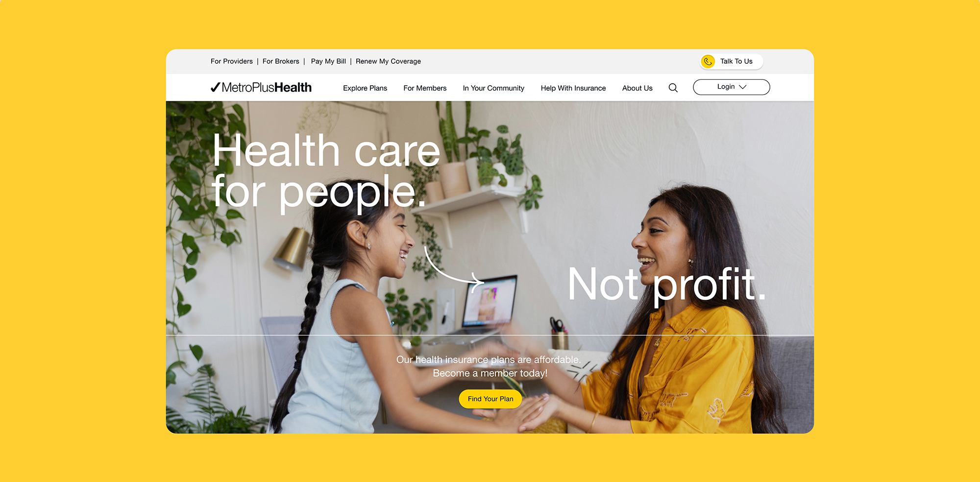
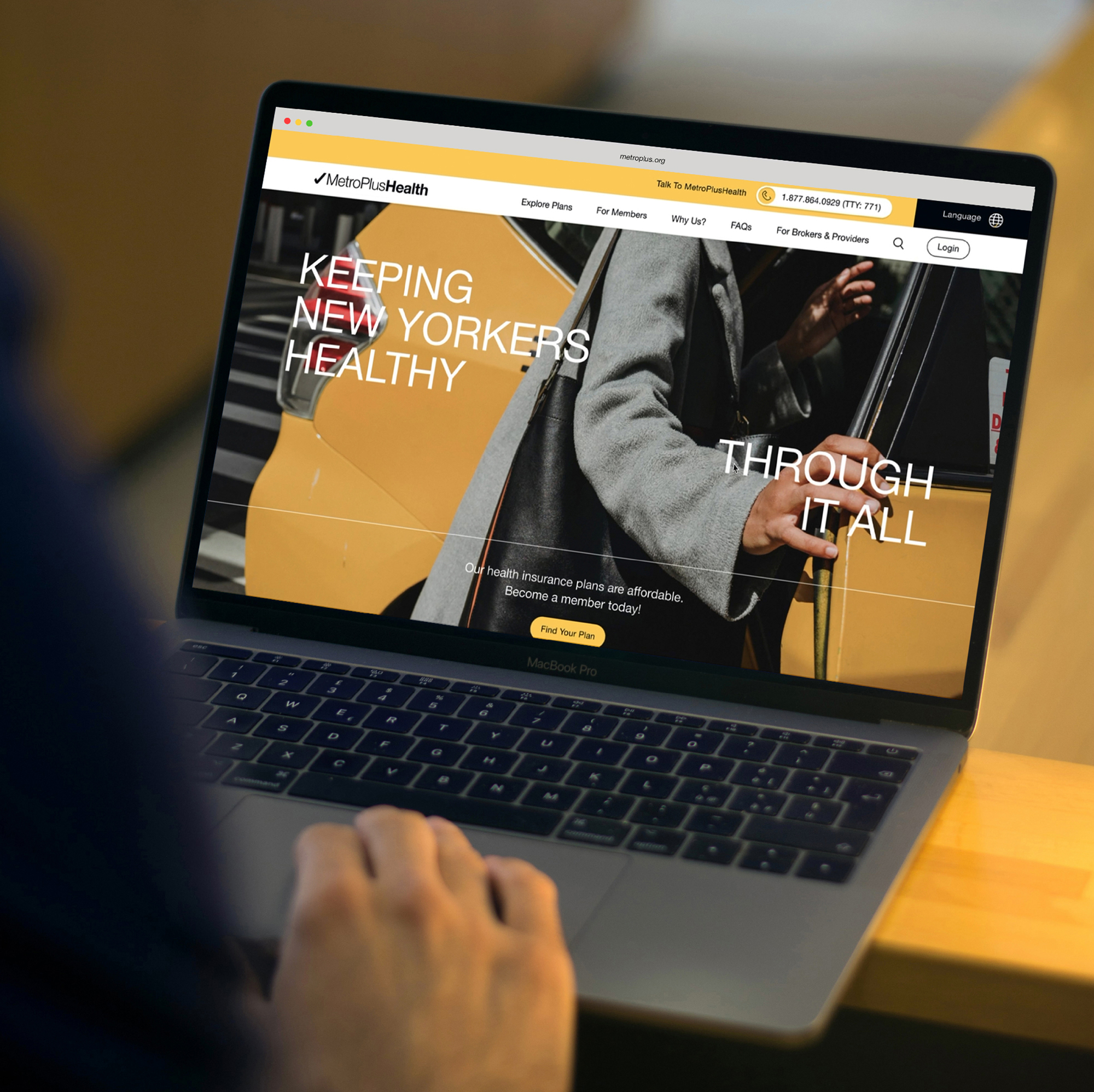
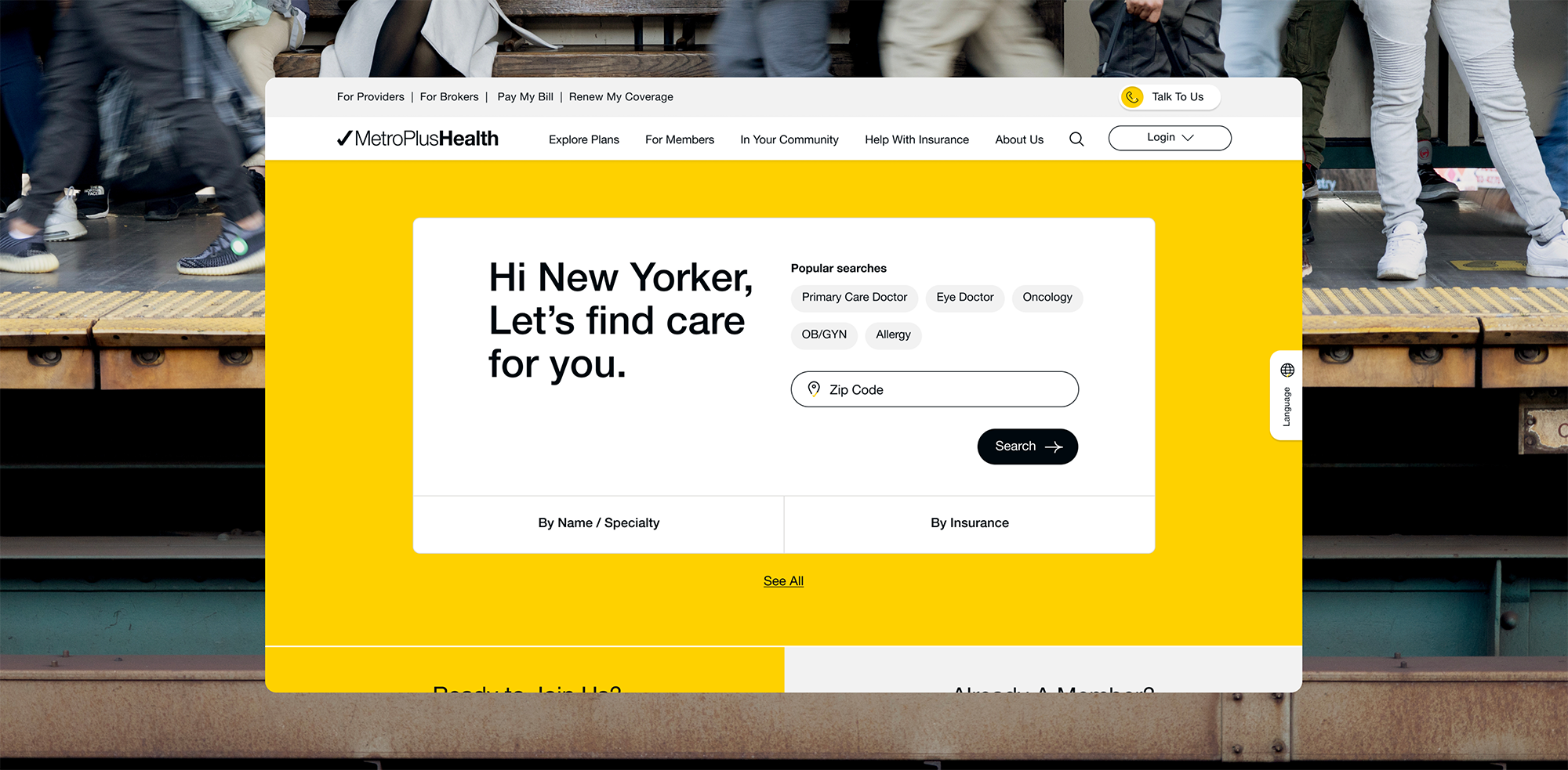
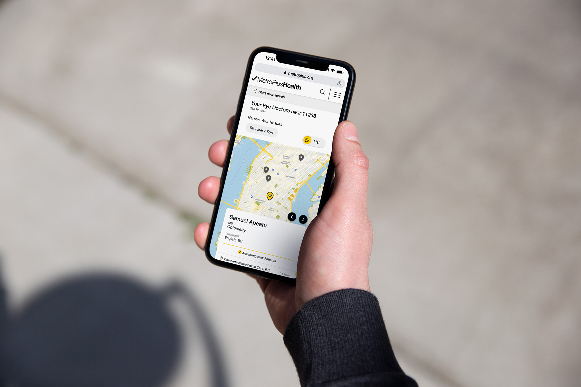
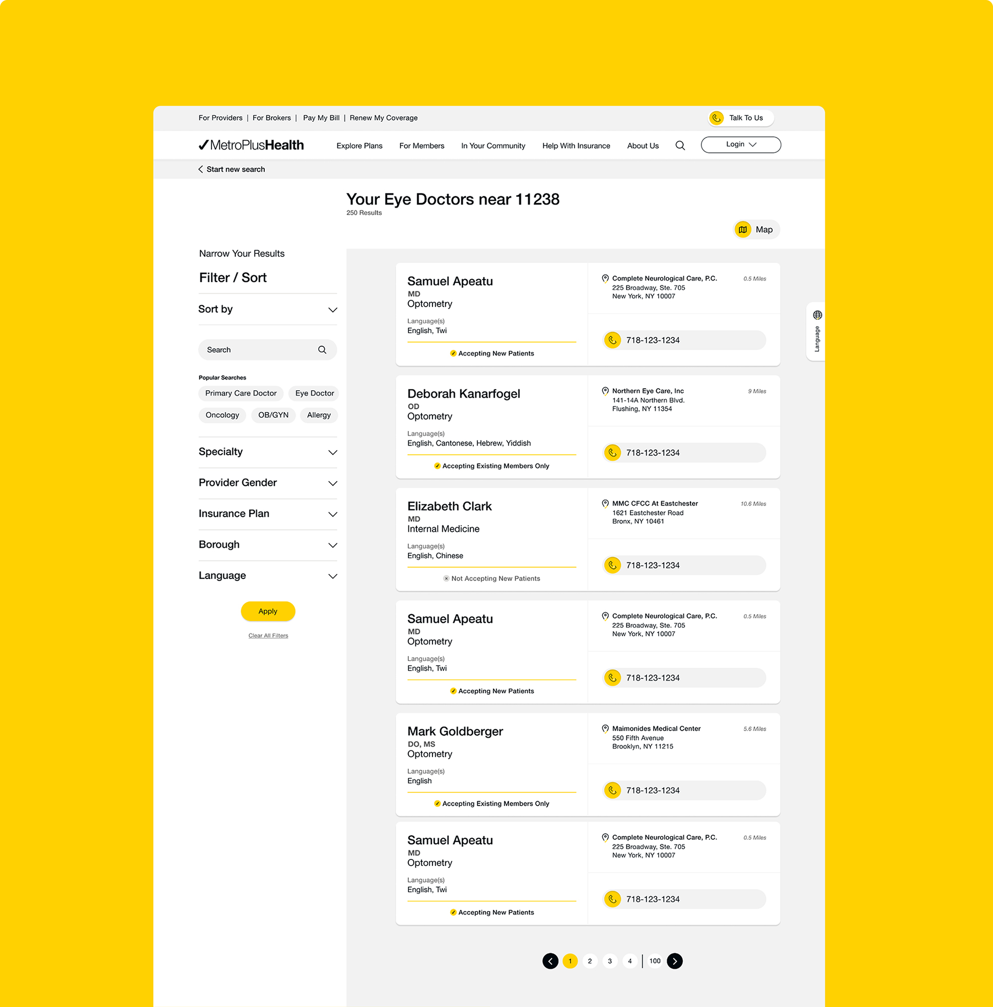
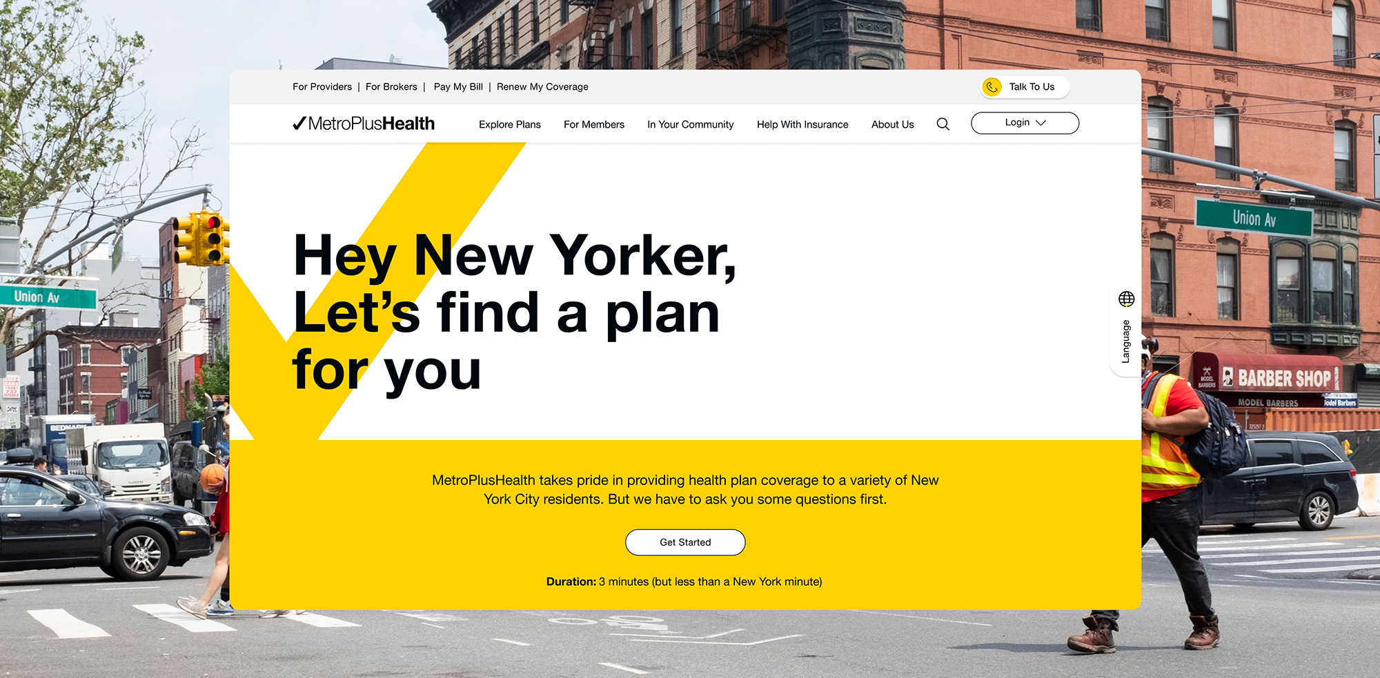
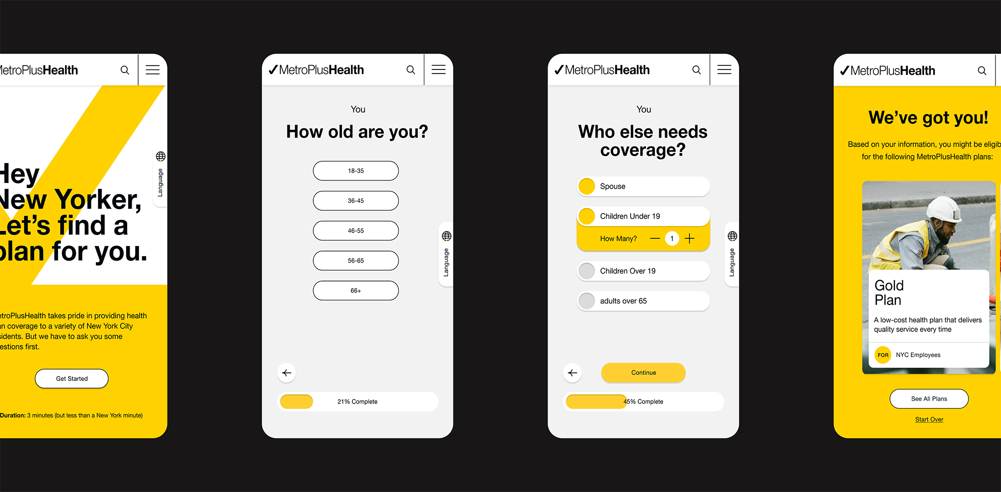
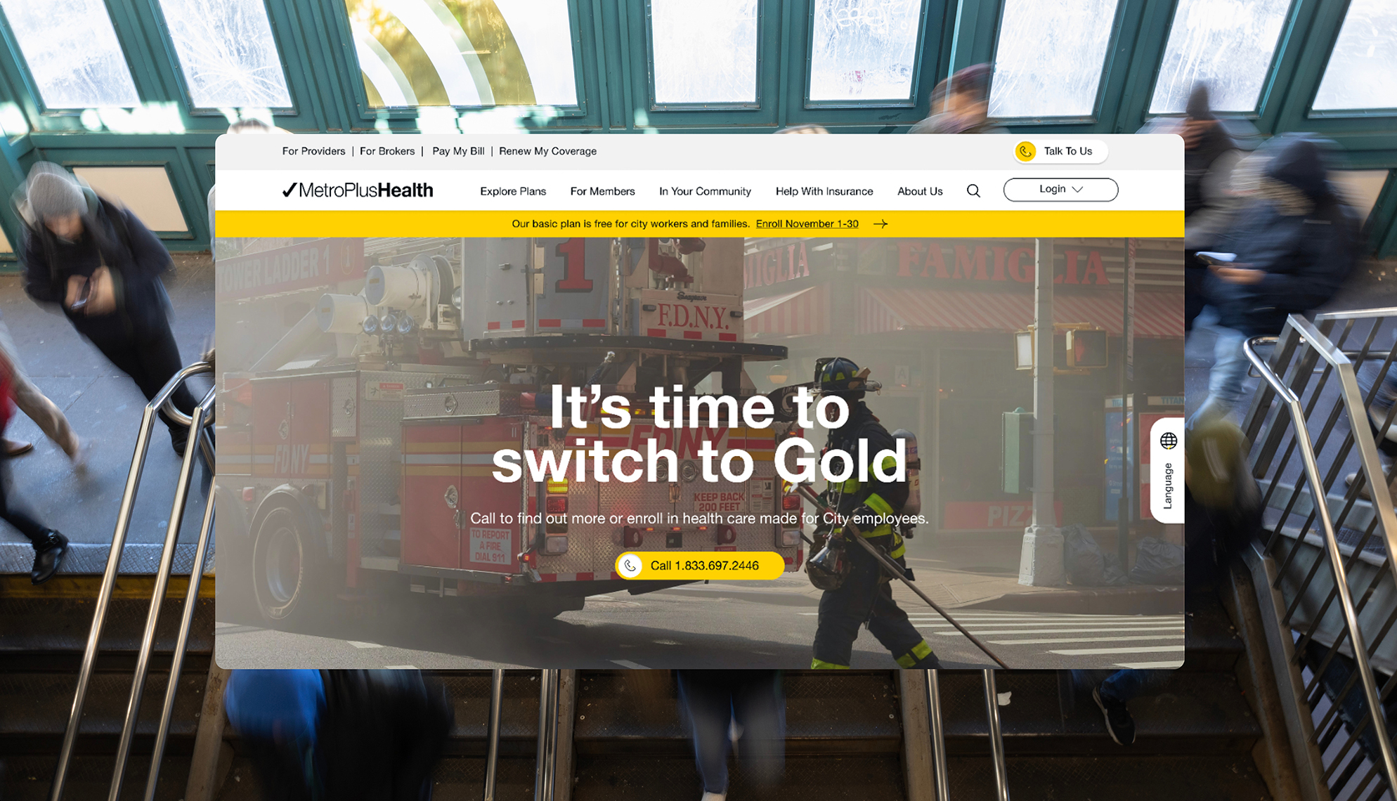
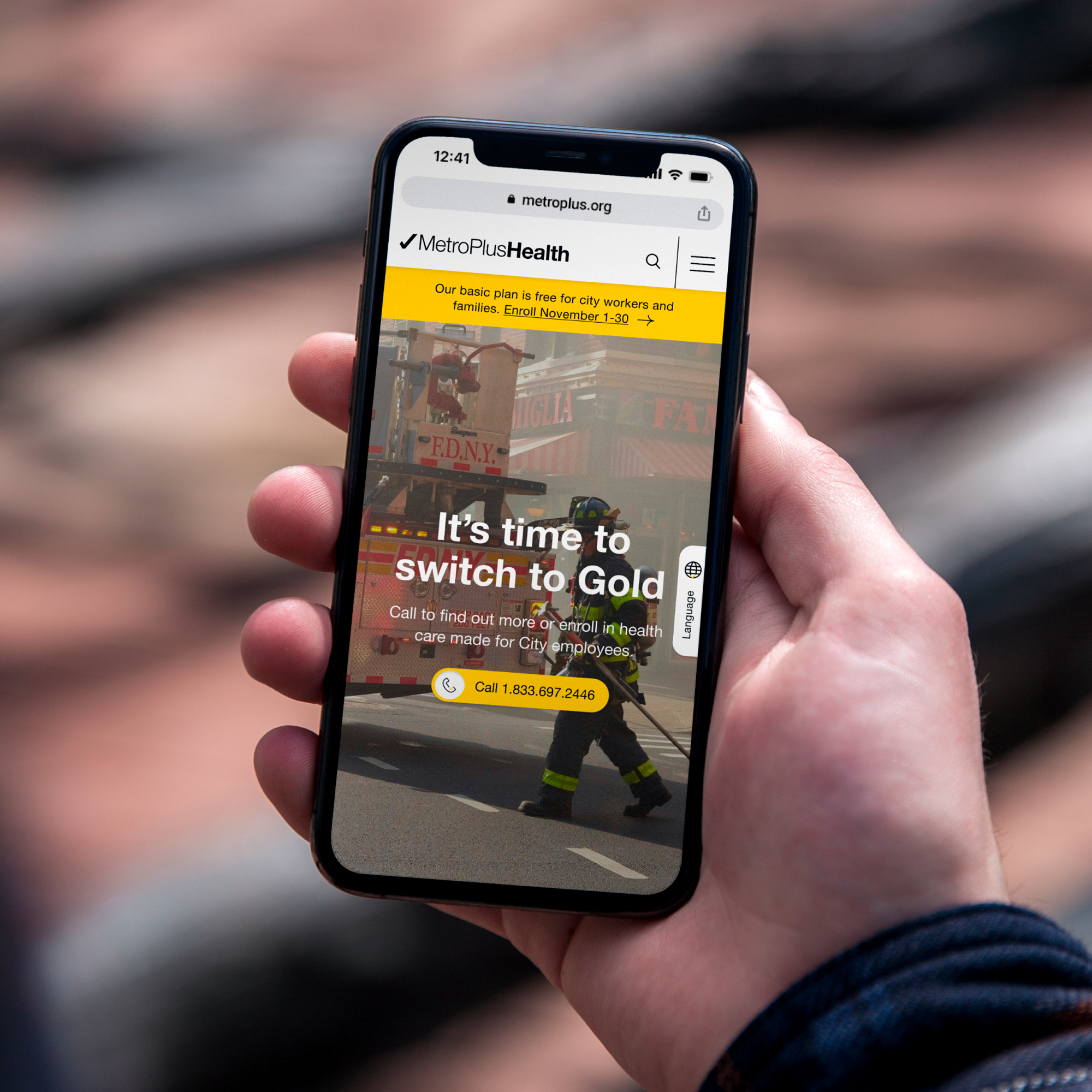
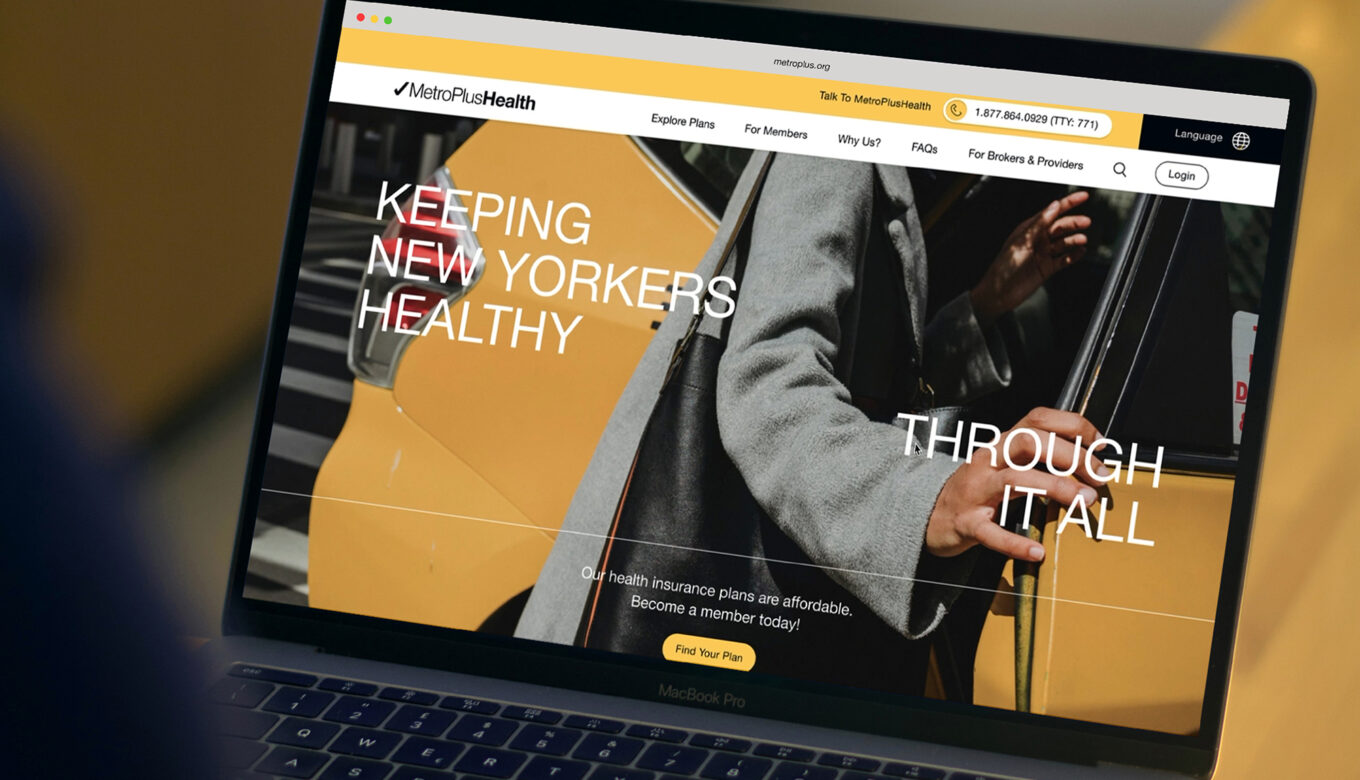
Our comprehensive relaunch of the MetroPlus.org goes beyond a mere aesthetic overhaul to fundamentally reimagine how users interact with and navigate the site.
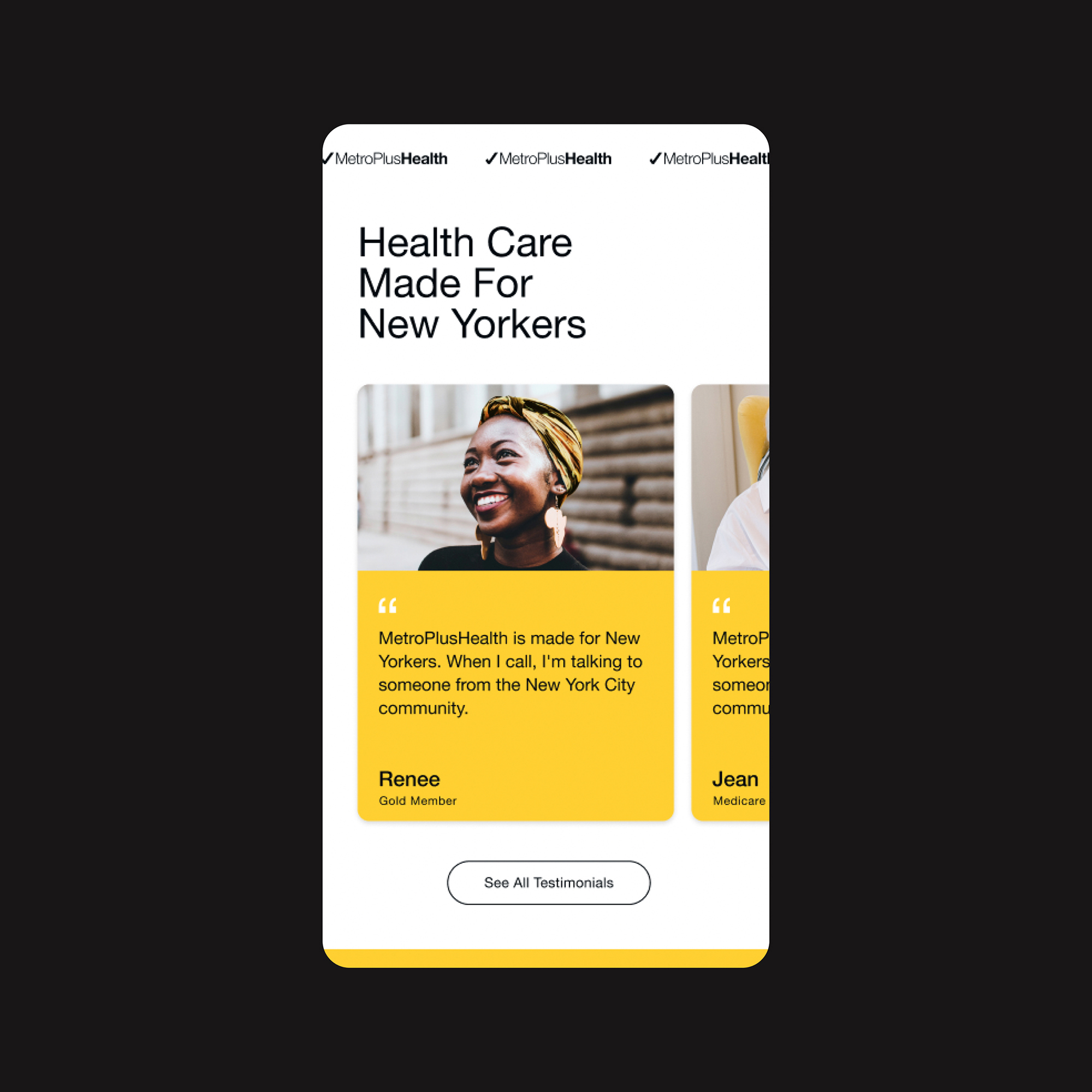
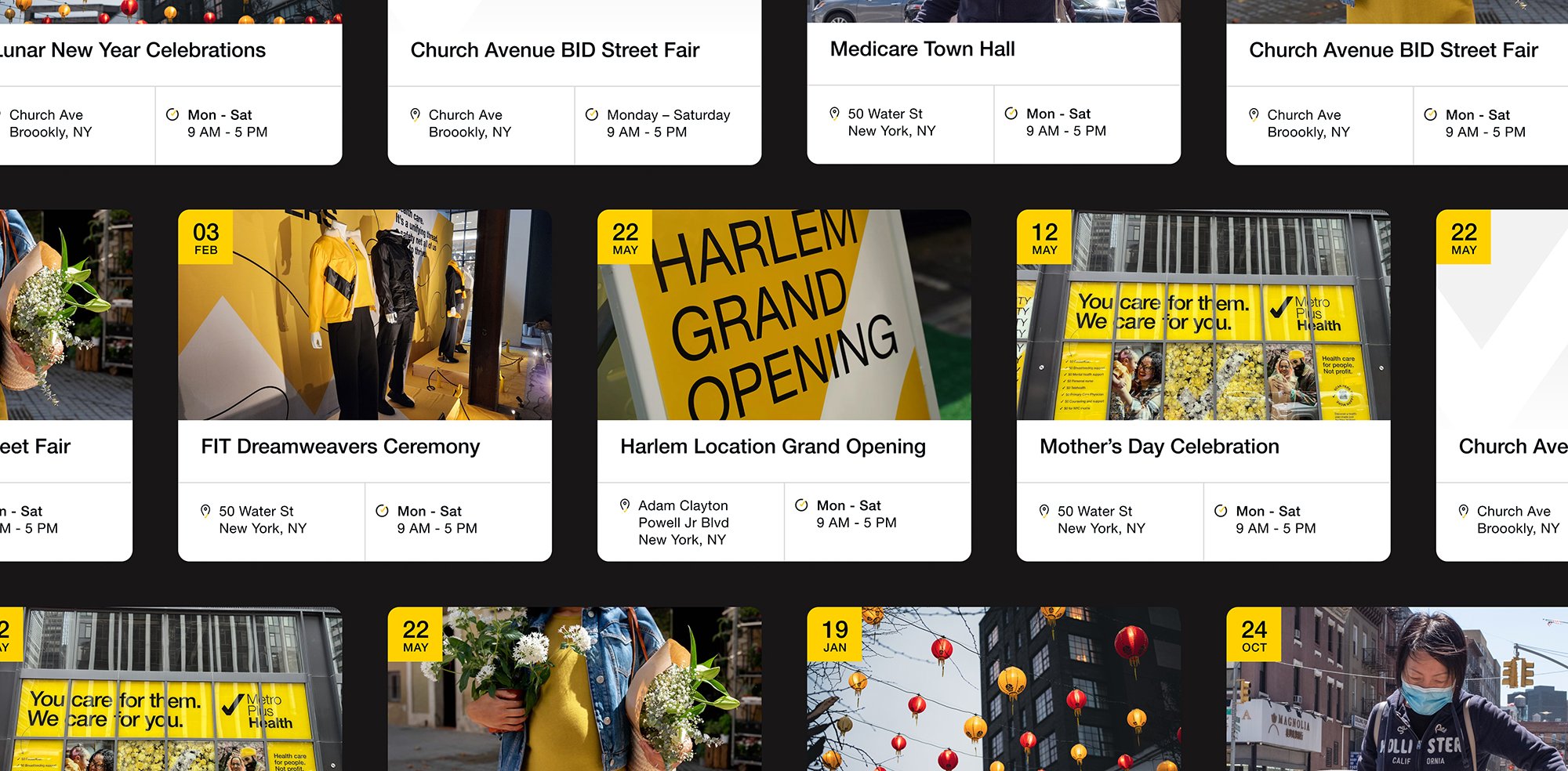
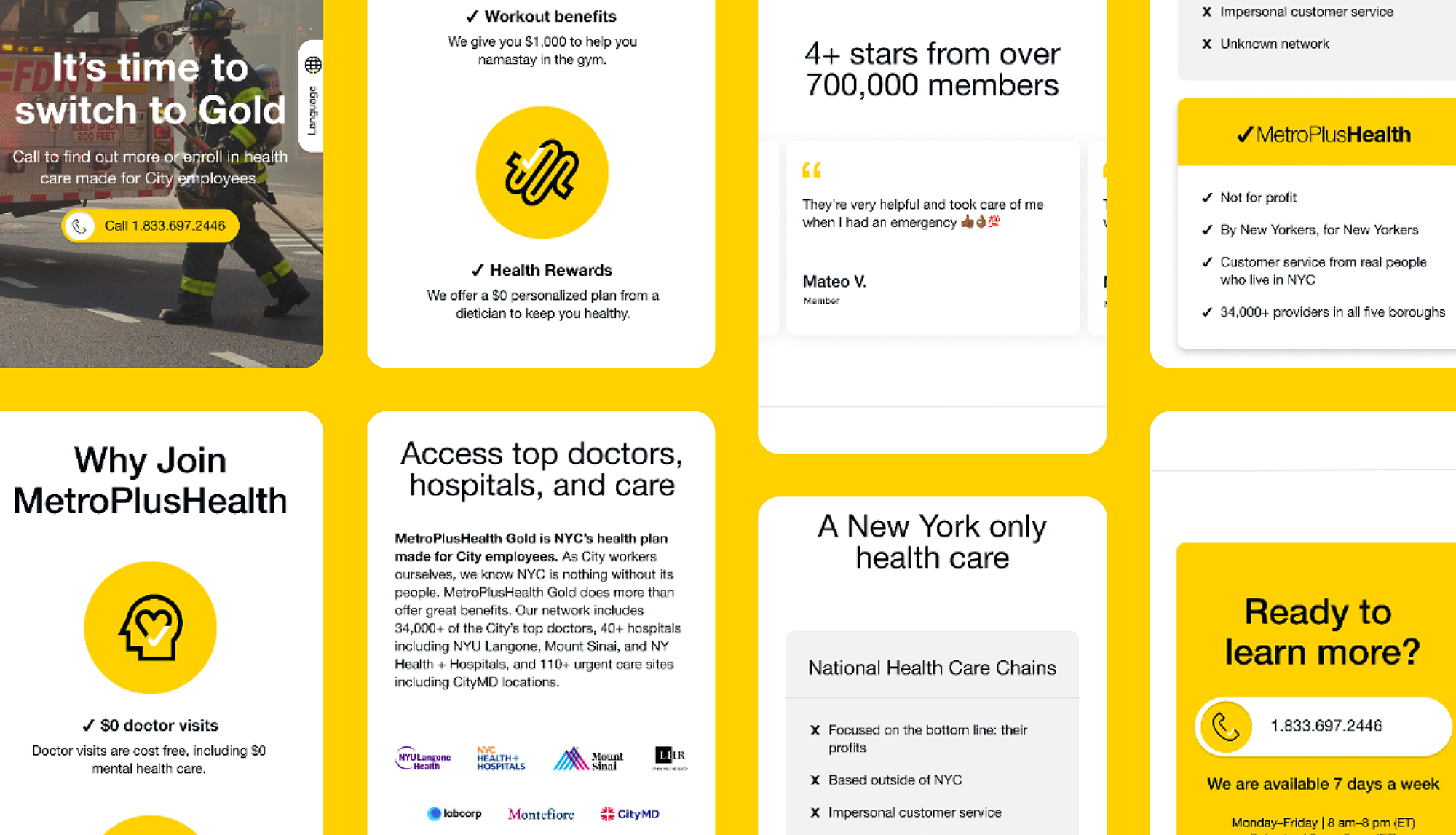
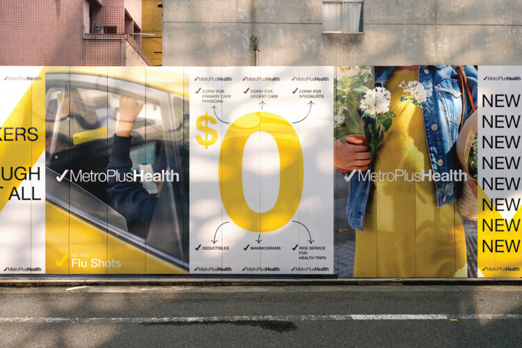
Central to our strategy was a complete reboot of the information architecture, transforming a legacy of dense, complex content into a streamlined, user-centric organization. We also rejuvenated the site with a warmer, more engaging UI and UX design, in line with the rebranding initiative we spearheaded.
The impact of these enhancements on user engagement and site performance has been nothing short of remarkable. Following the relaunch, MetroPlusHealth experienced an astonishing 250% growth in organic search visits, alongside a significant increase in overall site engagement. This project highlights our agency's ability to blend technical innovation with user-focused design, and sets a new benchmark for health care websites aiming to genuinely serve and engage with their communities.
