What is the difference between Pantone vs CMYK vs RGB? Are you looking for a royal blue color code in CMYK? Why can’t your laser printer make bright orange? You’re not imagining things and you’re not low on ink or toner: there are some colors that standard office printers can never produce. These same colors are not printable via affordable postcards or brochures. What are these crazy colors, and why do they look so dull in print?
CMYK vs RGB
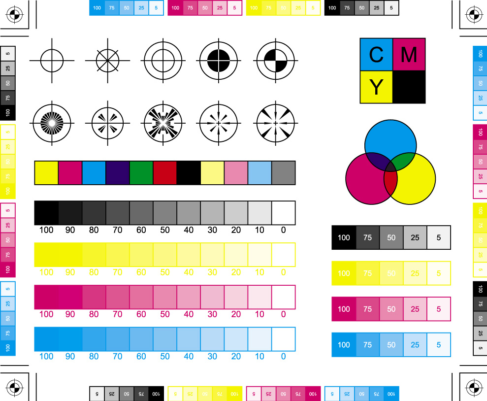
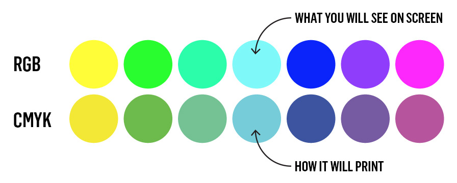
Printers use Cyan, Magenta, Yellow, and Black (CMYK) base colors to make other colors. (You remember the basic gist of how this works from kindergarten class.) Unfortunately, CMYK isn’t as robust as the yellow, blue, and red of our childhoods. Using CMYK, there is no way to make a bright cobalt blue, bright royal blue, bright green, or a vibrant royal purple. There is simply no recipe for combining CMYK that will make these colors. These crazy colors look great on screen (in RGB) but will forever be disappointing coming out of the printer. Here’s a quick overview of colors that look great on-screen, but terrible printed on a laser printer:
Pantone vs CMYK
How do I get bright colors to print? I’ve seen them before.
It’s not impossible to print cobalt blue, bright green, or bright purples. You just have to pay for Pantone color to get them. Pantone is a company that creates and sells ink. (Pantone has a much larger ink set than CMYK, so they can deliver colors CMYK can’t.) The bad news? You’ll have to pay extra for Pantone colors—sometimes it can add thousands to a print job. There are some Pantone colors that cannot be reproduced on a laser printer (yes, even if you have most expensive one.)
Pantone vs CMYK vs RGB
Why is this important?
Brands need to look vibrant and consistent across ALL mediums. Many designers and branding firms don’t worry about how color translates across mediums. They can convince you of a brand image that looks good on-screen but can’t be replicated in standard printing. Now you’re locked into paying for Pantone colors, or having a disjointed brand experience. You don’t have to become an expert in CMYK vs RGB vs Pantone. Ask your creative collaborators how your colors translate from print to web—if they don’t understand the question, that’s a red flag.
Strong brands = consistent, vibrant color
Color is crucial to branding. There is a big difference when your brand uses color effectively, and when you work with consultants who understand how to make colors pop. The added bonus in hiring color experts is vibrant branding that stands apart from competitors. The images below are not Photoshopped—these are actual images from an international “See it for Yourself” campaign seen in 7 different markets. They look so bright and clear because they were built with print or digital methods in mind. The images below prove that expert color makes a tremendous impact.
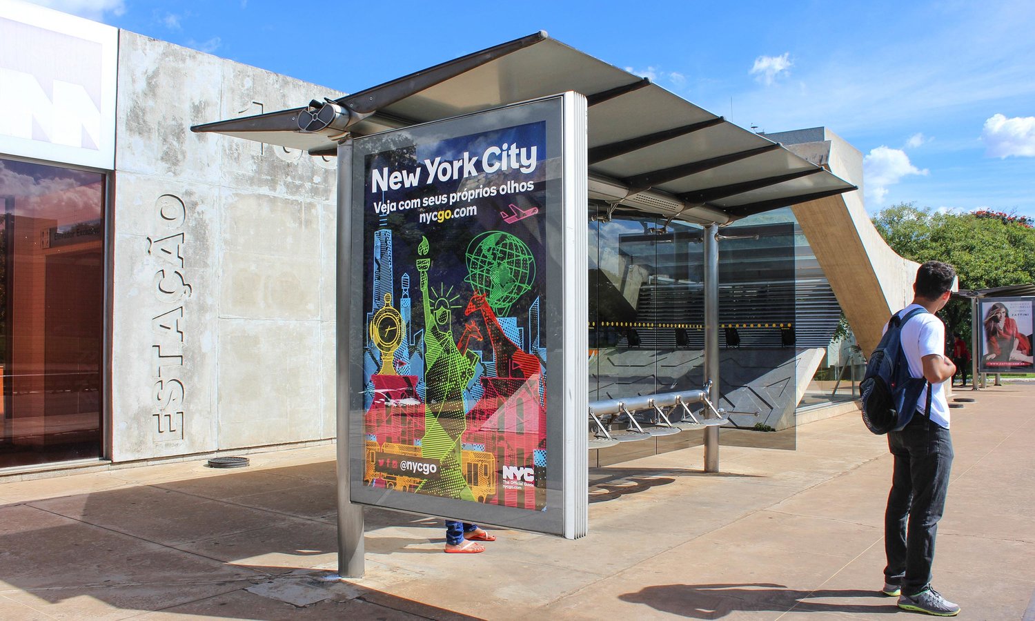
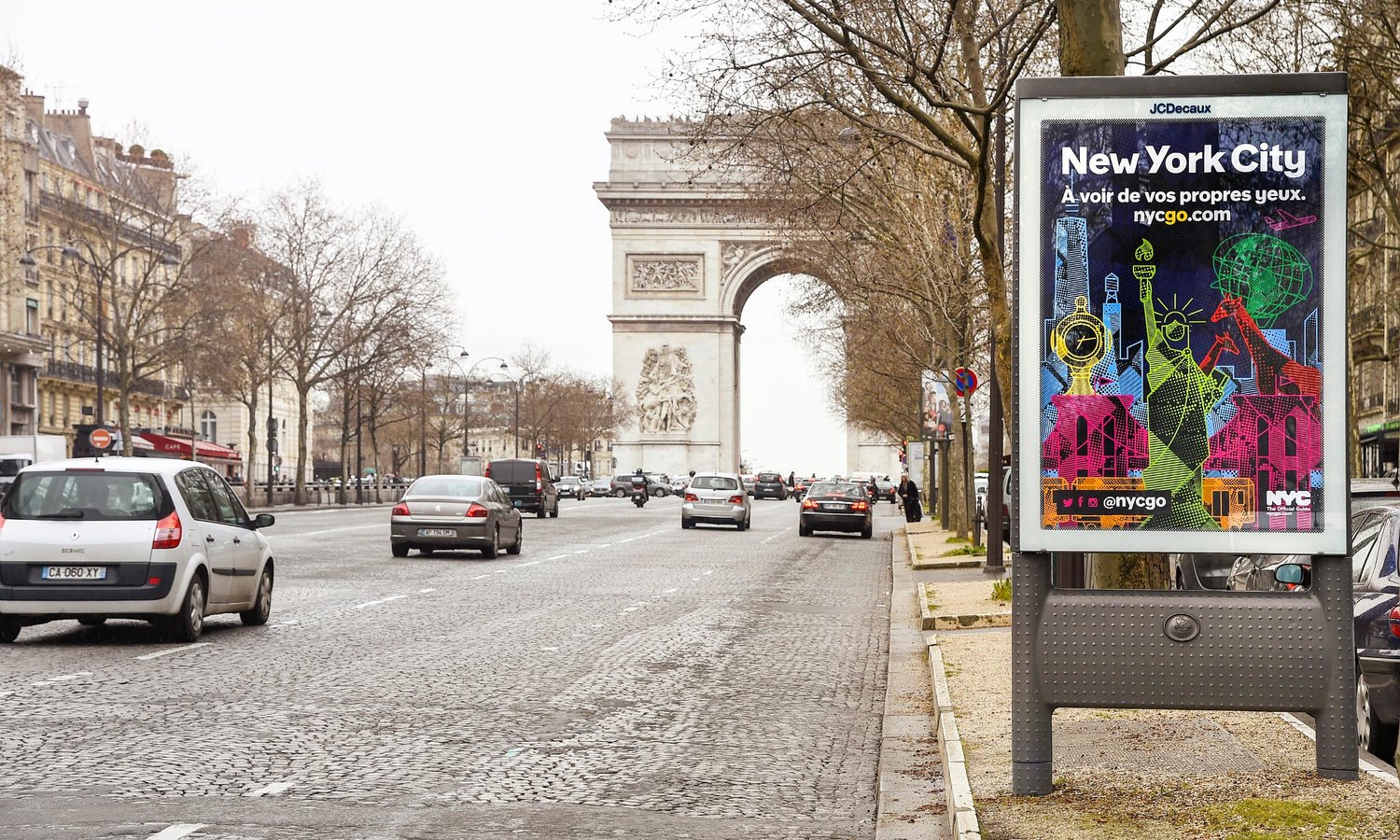
You can see more images from the “See It For Yourself” campaign here. Color is a crucial part of branding. A problematic color in your color palette can add thousands to your budget, or create a disappointing brand experience. Work with us to make sure your brand looks flawless in print and on screen.